
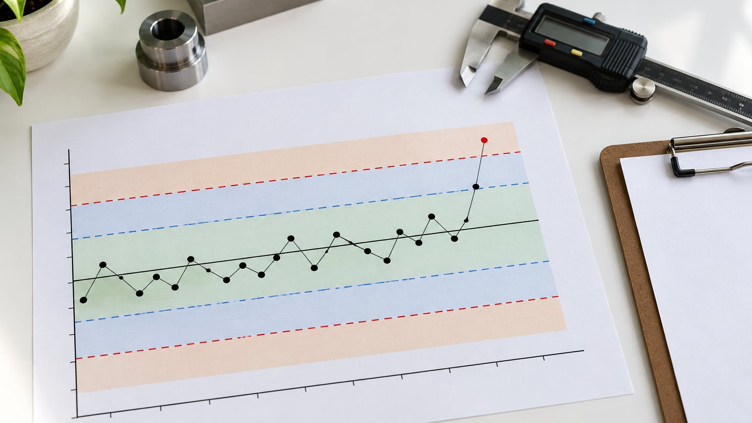
Control chart rules are standardized decision rules that tell you when a chart shows special-cause variation worth investigating. The original set is the four Western Electric rules; the set most plants run today is Lloyd Nelson’s eight, which adds tests for trends, oscillation, stratification and mixture.
This guide walks through all of them with production examples, explains the sigma zones they depend on, and covers the mistakes that quietly ruin a chart. Last updated for 2026.
Table of Contents
- What Are Control Chart Rules?
- How Do Control Charts Detect Special Causes?
- Control Chart Zones and Sigma Boundaries
- 8 Common Control Chart Rules Explained
- Rule 1: One Point Beyond the Control Limits
- Rule 2: Two of Three Consecutive Points Beyond Two Sigma
- Rule 3: Four of Five Consecutive Points Beyond One Sigma
- Rule 4: Six Consecutive Points Trending Up or Down
- Rule 5: Eight Consecutive Points on One Side of the Center Line
- Rule 6: Fourteen Alternating Points Up and Down
- Rule 7: Fifteen Consecutive Points Within One Sigma
- Rule 8: Eight Consecutive Points Outside One Sigma
- How to Apply Control Chart Rules in Manufacturing
- Common Control Chart Rule Mistakes
- Frequently Asked Questions
- Conclusion
What Are Control Chart Rules?
A control chart rule is a yes-or-no test applied to the points on a control chart. Pass and you keep running. Fail and you investigate.
Walter A. Shewhart built the chart in the 1920s; the Western Electric Company codified the interpretation rules in its 1956 Statistical Quality Control Handbook. Lloyd S. Nelson revised them in the October 1984 issue of the Journal of Quality Technology, adding four patterns the original set missed. Douglas C. Montgomery’s textbooks then carried the Nelson numbering forward, which is why nearly every modern reference quotes eight rules.
Two things people confuse constantly. First, control limits are not specification limits. Specification limits come from the customer, the drawing or a regulation. Control limits are calculated from your own process data and describe what the process has actually been doing.
| Limit | Where it comes from | What it means |
|---|---|---|
| USL / LSL | Customer requirement, drawing or regulation | Conformance: does the part meet the requirement? |
| UCL / LCL | Your collected baseline data, at 3 sigma | Control: is the process behaving as it has been? |
The second confusion: a rule violation is not a defect. It is a prompt to go look. Most signals turn out to be a gauge problem, a data-entry error or something you already fixed last week. The rule exists so that the decision to investigate is made by a documented test rather than by whoever is squinting at the chart at 6 a.m.
How Do Control Charts Detect Special Causes?
A stable process produces common-cause variation: the random scatter you get from normal machine-to-machine and material-to-material differences. It is unavoidable, it is predictable, and it is best handled by making the process capable rather than by chasing individual points.
Special-cause variation is different. It means something specific changed: a tool wore out, a resin lot arrived with different moisture, an operator adjusted a valve by hand, a night shift runs a different setting. A control chart is designed to notice the second kind quickly, before it spreads into a week of bad product.
The chart works off a centerline, which is the process average, and control limits set at three standard deviations either side of it. For a stable process, roughly three points in a thousand will land outside those limits purely by chance. That is the false alarm budget the rules spend from.
Here is the part that surprises people: a perfectly stable process can still produce parts outside specification. If the process average is off-center relative to the specification window, or the natural spread is wider than the tolerance, every point on your chart is comfortably in control and your scrap rate is still terrible. Control charts tell you about process stability. Only capability studies tell you whether the process can meet the spec at all.
Control Chart Zones and Sigma Boundaries
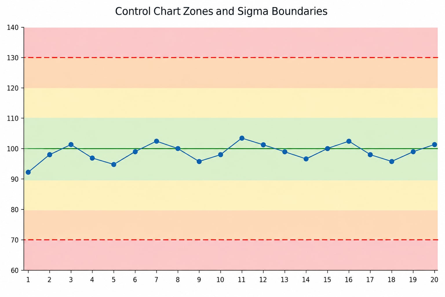
Zones are the bands between the centerline and the control limits. Almost every zone-based rule is a statement about how many points fall in which band, so the bands need to be defined before the rules make sense.
| Zone | Region | What a point there means |
|---|---|---|
| Zone C | Within 1 sigma of the centerline | Normal, and suspiciously tight if it happens too often |
| Zone B | Between 1 and 2 sigma | Still ordinary |
| Zone A | Between 2 and 3 sigma | Unusual enough to notice in groups |
| Beyond limits | Past 3 sigma | Rare. A single point here is worth a look. |
One warning. Zone lettering is not standardized. The 1956 Western Electric handbook put Zone A next to the control limits, Zone B in the middle and Zone C next to the centerline, and this guide follows that convention. Plenty of other references invert it, so Zone C sometimes means the outer band instead of the inner one. When a source says “three points in Zone C,” check which way it labels first. This single inconsistency is behind a surprising share of the confusion people bring to control chart training.
8 Common Control Chart Rules Explained
These eight are Nelson’s revision. The first three are the Western Electric originals; the rest catch the patterns a plain Shewhart chart lets walk past. Different sources number the same pattern differently, so the table below also tells you what each one is called elsewhere. Once you have picked a set, write its name on your chart. Half the arguments on a plant floor are really arguments about numbering.
Rule 1: One Point Beyond the Control Limits
One point plotted above the UCL or below the LCL. This is the simplest rule and the most specific: the observation is unusual relative to everything the process has done so far.
On an injection molding X-bar chart for cycle time, a single point at 34.8 seconds when the limits sit between 29.2 and 33.4 seconds is worth stopping for. Likely causes include a cold slug from a resin dryer fault, a stuck thermocouple, or a shift change that left the barrel temperature setpoint off. On a p chart for cosmetic defects, one point above the UCL usually means a genuine defect burst, because attribute data has no measurement resolution to soften it.
Rule 2: Two of Three Consecutive Points Beyond Two Sigma
Two out of three consecutive points land in Zone A or beyond, on the same side of the centerline. Clustering is the signal, not either individual point.
Why clustering matters is the run probability. A single point at 2.5 sigma happens now and then in a healthy process. Three points in a row all beyond 2 sigma on one side happens roughly 1 time in 200. Sustained readings that far from average point to a process shift that a single lucky observation would never have proven.
Watch for the error here: the points must be consecutive and on the same side. Two high points and one low point do not satisfy the rule, even when all three sit in Zone A. Many spreadsheet templates skip the same-side check, which inflates false alarms noticeably.
Rule 3: Four of Five Consecutive Points Beyond One Sigma
Four of five consecutive points fall outside Zone C on the same side. No point leaves the control limits, and the process still earns a signal.
This is the rule that catches small shifts. A process nudged one sigma to the high side still makes perfectly good parts, and it will keep doing so for months before anyone notices the scrap creep. On a packaging line measuring fill weight, five consecutive subgroups all running slightly over target will not trip Rule 1, and the total giveaway cost at end of year is considerable.
Four out of five beyond one sigma occurs about once in 7 observations on a stable process, so treat it as an investigate-level signal rather than a stop-the-line one.
Rule 4: Six Consecutive Points Trending Up or Down
Six consecutive observations move steadily in one direction, up or down. Nelson considers direction only, not whether the points sit above or below the centerline.
Trends are how wear shows up. A mold cavity polishing out, a thermocouple drifting, resin temperature creeping as a heater element ages, a die slowly losing its cut. Each individual point is unremarkable. The slope is the news, and by the time a trend breaches a control limit the worn part has usually produced a whole run of off-dimension parts.
Count the streak carefully. Once the direction breaks, the count restarts from one. Seven, eight or nine-point trend rules all exist in the wild; Nelson settled on six, and the difference between them is where much of the numbering confusion comes from.
Rule 5: Eight Consecutive Points on One Side of the Center Line
Eight consecutive points, all above or all below the centerline, no requirement about distance from it. A process whose average has quietly moved still draws a chart that looks completely normal, because the centerline has moved with it.
This is prolonged bias. Nelson’s original version used nine points; Western Electric used eight; many course materials say seven. All three describe the same idea with slightly different sensitivity, which is why you will see all three numbers in the same plant. The probability explains the choice: eight in a row on one side has a 1-in-256 chance under random conditions (0.39%), while a single point beyond 3 sigma has a 1-in-370 chance (0.27%). Six in a row is weaker still at about 1.56%.
One caution on attribute charts. Four consecutive points at zero on a c chart are statistically in control, because a count chart often sits at zero for good reasons. You need a much longer run before it means anything.
Rule 6: Fourteen Alternating Points Up and Down
Fourteen consecutive points that alternate above and below the centerline. Every point is inside the limits, yet the chart is telling you something.
Alternation usually means somebody is fighting the process. An operator nudging a setpoint every time a reading looks high creates exactly this pattern, and so does a control loop that’s hunting. Another cause is two distinct process states alternating, which is what stratified or batched production often produces.
Do not treat every alternation as proof of instability. Fourteen is deliberately a high bar: the chance of that pattern arising by itself is around 1 in 4,000. When it fires, look first at whether anyone is adjusting the process in response to individual points. That is the over-control, or tampering, signal, and it is one of the most valuable rules on the list because it catches a habit rather than an event.
Rule 7: Fifteen Consecutive Points Within One Sigma
Fifteen consecutive points all sitting within one sigma of the centerline, meaning every point lands in Zone C. A narrow cluster is as suspicious as a wide one.
The usual explanation is a measurement system that cannot resolve what it claims to measure. A scale rounded to the nearest unit, a gauge with insufficient resolution, or a reporting step that clips values into a band will produce exactly this pattern on a perfectly healthy process. It also shows up when two or more data streams are mixed into one chart, each with a slightly different average, so the combined distribution looks deceptively tight.
Same caveat as the zones: confirm which band your reference calls Zone C before you accept the test. If the chart is also picking up stratification or mixture behaviour, the zone definition matters more than the point count.
Rule 8: Eight Consecutive Points Outside One Sigma
Eight consecutive points, all beyond one sigma from the centerline, on either side. Note the difference from Rule 5: the points may be high and low in any order, but none of them sit near the average.
Rule 8 catches bimodal behaviour, where a process is alternating between two states instead of centring on one. A press running at two moulding pressures on alternate shots, a measurement taken at two different stations, a batch of parts produced with a different fixture. Nothing here looks like a shift or a trend, but the average is a fiction and the process capability numbers computed from it will mislead you.
Because it does not require a consistent side, Rule 8 fires on mixture and on over-control as readily as on instability. Read it alongside Rules 5, 6 and 7 rather than on its own.
| Pattern | Western Electric | Nelson | Westgard (lab QC) | Problem indicated |
|---|---|---|---|---|
| One point past 3 sigma | Rule 1 | Rule 1 | 1_3s | Grossly out of control |
| 2 of 3 past 2 sigma, one side | Rule 2 | Rule 2 | 1_2s warning | Small sustained shift |
| 4 of 5 past 1 sigma, one side | Rule 3 | Rule 3 | 2_2s | Small shift or bias |
| Trend | Not in the original 4 | Rule 4 (6 points) | Trend rule | Tool wear, drift |
| Run on one side | Rule 4 (8 points) | Rule 5 (9 points) | 4_1s / 10_x | Prolonged bias, shift |
| Alternating points | Not in the original 4 | Rule 6 (14 points) | 10_x | Over-control, oscillation |
| Tight cluster near average | Not in the original 4 | Rule 7 (15 points) | Not used | Stratification, poor resolution |
| All points away from average | Not in the original 4 | Rule 8 (8 points) | Not used | Mixture, bimodal behaviour |
The table is the practical answer to the most common question on this topic. The same pattern carries four different names depending on which manual you read. Westgard rules are a separate family built for laboratory and clinical quality control, where a single failed control result means a patient-impacting decision, and they trade Shewhart’s specificity for much higher sensitivity.
On false alarms, the figures worth knowing come from Champ and Woodall’s 1987 work in Technometrics. Rule 1 alone fires roughly once in 370 observations on a stable process. All four Western Electric rules combined fire about once every 92 observations. Add the four Nelson patterns to that set and the average run between alarms drops further, which is exactly why phased rollout matters on a busy chart.
How to Apply Control Chart Rules in Manufacturing
Pick the chart first. Variable data measured in subgroups of two to nine goes to an X-bar chart with an R or S chart. Individual measurements with no logical subgroup go to an individuals and moving range chart. Proportions of defective units go to a p or np chart, counts of defects to a c chart, and defects per unit to a u chart. ISO 7870-1 lays out the selection logic if you want the formal version.
Not every rule belongs on every chart. The zone tests assume points are independent draws from a common distribution with a central line in the middle. The moving range column of an I-MR chart is a range of two consecutive values, so it cannot be high, low or trending in any meaningful sense, and zone tests on it produce nonsense. CUSUM and EWMA charts are a different animal entirely: they accumulate weighted deviations precisely so that small sustained shifts stand out, so layering Nelson’s zone tests on top of them double-counts the same evidence. Keep the rules for Shewhart charts and let CUSUM and EWMA do their own job.
Subgroup rationally. The classic example is an injection molding machine where barrel temperature drifts within a shift, so you sample within a shift rather than across shifts. Sampling across the drift buries the signal you are looking for. Rational subgrouping is the single highest-leverage decision on the chart, and our guide to statistical sampling plans explained for molders covers how to size subgroups when your convenience sample is hiding the drift you need to catch.
Build limits from 25 to 30 subgroups of stable data, no more. If you cannot find 25 subgroups of demonstrated stability, you have a problem that a control chart will not solve, and reaching further back into unstable history only widens the limits until nothing signals. Recalculate limits when the process genuinely changes, such as a new resin, a new machine or a deliberate improvement. Never recalculate because a signal was inconvenient.
Then apply the rules, document the signal, and investigate. A workable sequence is: identify which rule fired and where; check the measurement system and the data entry first; walk the change history for that time window, including shifts, materials and maintenance; form a cause hypothesis and test it; correct it; keep the old limits running until the corrected process has produced enough new stable data to justify a new baseline. Record the outcome either way. A signal with no assignable cause found still counts, because an unexplained shift that you absorb into the process quietly widens your natural variation and makes the chart less sensitive forever after.
Escalation helps when a chart generates more alarms than the team can absorb. Level one, a Rule 1 hit, gets same-shift investigation. Level two, Rules 2, 3 or 4, gets a check within the shift and a written note. Level three, the Nelson patterns 5 through 8, gets reviewed at the weekly quality meeting. Roll the rules out in the same order: Rule 1 alone for the first month, then 2 and 3, then 4, and only then the run and pattern rules. Turning everything on at once produces the alert fatigue that ends most SPC programmes.
| Pattern you see | Likely operational cause | First action |
|---|---|---|
| One point past a limit | Tool or sensor failure, bad material lot, handling error | Verify the measurement, then check that part’s raw material and machine |
| Shift on one side of the average | Different shift setup, a recipe change, a supplier change | Compare process settings by shift |
| Slow trend | Tooling wear, calibration drift, accumulating variation | Pull the tool or check calibration |
| Alternation | Operator adjustment between every part, control loop hunting | Watch the line for ten minutes |
| Tight cluster | Resolution too coarse, mixed data streams, round-number reporting | Check gauge resolution |
| Two alternating levels | Two moulds, two machines, two operators on one chart | Stratify the data and chart each stream |
None of this is limited to the plant floor. The same rules track order cycle time in a warehouse, patient wait times in a clinic, ticket resolution time in a service desk or pick accuracy in a distribution centre. The arithmetic does not change, and the causes look familiar once you have seen them on a molding machine.
Common Control Chart Rule Mistakes
Deleting the point that fired the rule. This is the big one. An out-of-control point is evidence, and removing it makes the chart agree with your wishes. If a point is wrong, correct it and record why.
Recalculating limits after every signal. New limits drawn around an out-of-control process will always look stable, because they were built from unstable data. The chart stops being able to tell you anything within a week.
Using a rule outside its conditions. Zone tests on moving ranges, or on CUSUM and EWMA charts, produce alarms that mean nothing. Check what the rule assumes before you enable it.
Mixing data streams into one chart. Two cavities, two machines or two shifts on a single series produces mixture and stratification patterns that look like process problems and are actually a chart design problem.
Treating specification limits as control limits. Drawing a target line at the customer requirement and calling it the centerline hides every shift. Control limits belong where the process has actually been running.
Reacting to every alarm. The false alarm budget is real, and if your team investigates all of them, they will stop investigating any of them. This is why the phased rollout exists.
Stopping to investigate without a response owner. A signal with nobody assigned becomes a signal with no action. Name the role that responds and the time limit, and put both in the procedure.
Frequently Asked Questions
What is the most important control chart rule?
Rule 1, a single point beyond the upper or lower control limit, is the most important in most plants. It identifies one observation that is unusual relative to the process’s own estimated variation, and it points at a specific event rather than a vague pattern. Rules 2 through 8 are not less valid; they catch smaller shifts earlier but give you less to investigate. Teams that can only run one rule should run Rule 1.
Are control chart limits the same as specification limits?
No. Specification limits are usually set by the customer, the drawing or a regulation and define acceptable performance. Control limits are calculated from collected process data and describe what your process has actually been doing. A stable process can still produce out-of-spec parts when its average sits off-center or its natural spread exceeds the tolerance, which is why capability studies sit alongside control charts.
Why does a control chart show false alarms?
Every statistical rule has a chance of firing on a perfectly stable process. A single point beyond 3 sigma happens roughly once in 370 observations, and all four Western Electric rules together fire about once every 92 observations. False alarms become a real problem when you enable every rule on every chart, which is the main reason teams work through rules gradually instead of switching them all on at once.
Should every control chart signal stop the process?
Not automatically. A signal means the process may have changed and deserves a structured investigation, not that the current part is defective. Check the measurement system, review the change history, and test a cause hypothesis. With Rule 1 on a stable process the odds that the signal is real are high, so a same-shift check makes sense, but stopping and scrapping output on every alarm trains people to ignore the chart.
Why do control chart rules differ between sources?
Because there is no single governing standard for pattern tests. Western Electric published four rules in its 1956 handbook, Nelson revised them to eight in 1984 to improve sensitivity, and Westgard built a separate high-sensitivity family for laboratory work. The patterns overlap heavily and the numbering does not, so the same run test can be Rule 4, Rule 5 or Rule 8 depending on the manual. Name the rule set you use on the chart itself.
What is the rule of 7 in a control chart?
It usually means seven or more consecutive points sitting on one side of the centerline, which indicates a sustained shift in the average. Sources vary between seven, eight and nine points because they trade sensitivity against false alarms: eight in a row occurs about once in 256 observations on a stable process. Nelson used nine, Western Electric used eight, and many training materials say seven. All three describe the same pattern.
Conclusion
Start by documenting which rule set your plant uses and writing its name on the chart. Then verify the control limits were calculated from stable data, not from history that already contained problems. From there, enable Rule 1, get used to investigating every signal properly, and only then add the zone and run rules. For the sampling side of the work, our guide to statistical sampling plans explained for molders covers how to size subgroups. Keeping the records straight is a separate discipline covered in document control basics for quality systems, and the defects themselves are mapped in the injection molding defects chart and fixes.