

A Pareto chart is a bar chart sorted from largest to smallest with a cumulative percentage line drawn across it on a second axis, and building one takes about ten minutes in Excel or a few minutes with pen and paper. To make a Pareto chart, sort your categories by count or cost, plot them as bars, then add a line showing each running total divided by the grand total so you can see how few causes drive most of the problems.
On a plant floor that chart is usually the difference between chasing 40 defect codes and fixing the three that cause 80% of your scrap. Here is the whole process, from a list of raw counts to a finished chart you can drop into a quality review.
It works just as well on categories that come from outside the plant. Sort inbound rejects by supplier and the same chart becomes a supplier scorecard, which feeds straight into a make or buy decision analysis when one vendor accounts for most of the incoming problems.
Table of Contents
- What You Need
- Step-by-Step: How to Make a Pareto Chart
- Step 1: Choose the Problem and Measurement
- Step 2: List and Count the Causes
- Step 3: Sort the Data from Largest to Smallest
- Step 4: Calculate Percentages and Cumulative Percentages
- Step 5: Create the Pareto Chart in Excel
- Step 6: Create a Pareto Chart by Hand
- Step 7: Interpret the Chart and Decide What to Fix First
- Common Mistakes
- Frequently Asked Questions
- Conclusion
What You Need
You need five things, and four of them are data you probably already have in a log, a nonconformance report or a maintenance system.
- Categories. The defect, failure mode, machine, supplier or cause names you will compare. Keep them specific and mutually exclusive so nothing is counted twice.
- One consistent measure. Defect count, scrap cost in dollars per week, downtime minutes, or complaint volume. Pick exactly one for the whole chart.
- A total and a time window. The grand total of that measure plus the period it covers, so the percentages mean something. “Last four weeks of final inspection rejects” beats “recent problems”.
- A spreadsheet or paper. Excel or Google Sheets for the formula-driven version; a printed table and a ruler work fine for the manual version.
- Clear units on the axes. The primary axis labeled with the measure and its unit, the secondary axis labeled in percent from 0% to 100%.
If your categories come from a machine rather than an inspection report, sort the defect names first so they are consistent between this chart and the last one you showed the team.
Step-by-Step: How to Make a Pareto Chart
Step 1: Choose the Problem and Measurement
Write the question the chart has to answer in one sentence, such as “which defect types caused the most rejected units in Q3”. Then choose a single measure and one time window.
Count works for frequency questions, cost works for scrap and rework dollars, downtime minutes work for maintenance. Mixing them, such as counting some defects and costing others, produces a chart nobody can act on.
Step 2: List and Count the Causes
Put each category in column A and its frequency or cost in column B. Add an “Other” row so rejected, mislabeled or unrecorded items still appear somewhere instead of quietly shrinking your total.
Resist the urge to invent subcategories during this step. If “weld defects” is doing all the work, split it later with a fishbone diagram, not with guesswork in the spreadsheet.
Step 3: Sort the Data from Largest to Smallest
Sort rows 2 to the last row by column B, largest to highest. The descending order is what makes a Pareto chart different from a plain bar chart, and it is the part Excel forgets if you skip this step.
For ties, sort the tied rows alphabetically or by a secondary measure such as cost. Just keep them adjacent, otherwise the cumulative line jumps around and the chart misleads.
Step 4: Calculate Percentages and Cumulative Percentages
In column C put each category’s share of the total, and in column D put the running cumulative percentage. With counts in B2:B8, the formulas are:
=B2/SUM($B$2:$B$8) for the percent of total, and =SUM($B$2:B2)/SUM($B$2:$B$8) for the cumulative percentage, copied down both columns.
Here is a worked example from injection molding rejects over four weeks, using 118 total defects:
| Defect | Count | % of total | Cumulative % | Crosses 80%? |
|---|---|---|---|---|
| Short shot | 42 | 35.6% | 35.6% | No |
| Out of tolerance | 31 | 26.3% | 61.9% | No |
| Flash | 18 | 15.3% | 77.1% | No |
| Scratches | 12 | 10.2% | 87.3% | Yes |
| Contamination | 7 | 5.9% | 93.2% | No |
| Warpage | 5 | 4.2% | 97.5% | No |
| Other | 3 | 2.5% | 100.0% | No |
The first three categories reach 77.1%, and scratches carry the line past 80% at 87.3%. That is your vital few: four defect types out of seven, 103 of 118 defects. It also tells you where to stop reading, which is the point of building the chart.
Step 5: Create the Pareto Chart in Excel
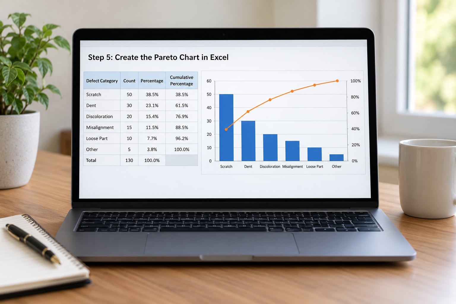
Excel 2016 and Microsoft 365 have a built-in Pareto chart, which is the fastest route:
- Select columns A and B, keeping the header row.
- Open Insert, then Recommended Charts, then All Charts.
- Choose Histogram, then Pareto, then OK.
The built-in chart calculates the cumulative percentage itself. Use the combo method below when you need your own cut point, want to hide the long tail of small bars, or are on an older Excel version.
- Enter the category, percent of total and cumulative percentage columns next to your counts.
- Select the category, count and cumulative percentage columns.
- Choose Insert, then Charts, then Insert Combo Chart, then Create Custom Combo Chart.
- Set the count series to Clustered Column and keep it on the primary axis.
- Set the cumulative percentage series to Line, tick Secondary Axis, then OK.
- Right-click the secondary axis, choose Format Axis, and set Bounds Maximum to 1 so it stops at 100%.
- Select a bar, choose Format Data Series, and set Gap Width to roughly 30 so the bars sit close together.
- Add a 0.80 reference line: select the cumulative series, choose Chart Design, Add Chart Element, Line, then draw the line and format it as a dashed line.
Two formatting details do most of the work. The secondary axis default of 120% makes the line look like it fails before the last bar, and a wide default gap width makes the bars look like a generic bar chart. Fix both and it reads as a Pareto chart at a glance.
If you want the chart in a deck, copy it and paste into PowerPoint or Google Slides as an embedded object. Right-click the chart, choose Change Chart Type, and the series stay attached to the sheet.
Step 6: Create a Pareto Chart by Hand
The paper version needs a sorted table, two scales and a steady hand. Draw the primary axis with the measure and unit, one column per category in descending order, and bar heights proportional to the count.
Draw a second axis on the other side from 0% to 100%, then plot the cumulative percentage above each bar, starting at zero in the bottom corner of the plot area rather than at the height of the first value.
Connect those points with a straight line. Add a dashed vertical line where the curve crosses 80%, label the bars with their counts, and write the date range and unit in the chart title. Label it before you present it, because an unlabeled hand-drawn chart gets questioned in the meeting instead of in the data.
Step 7: Interpret the Chart and Decide What to Fix First
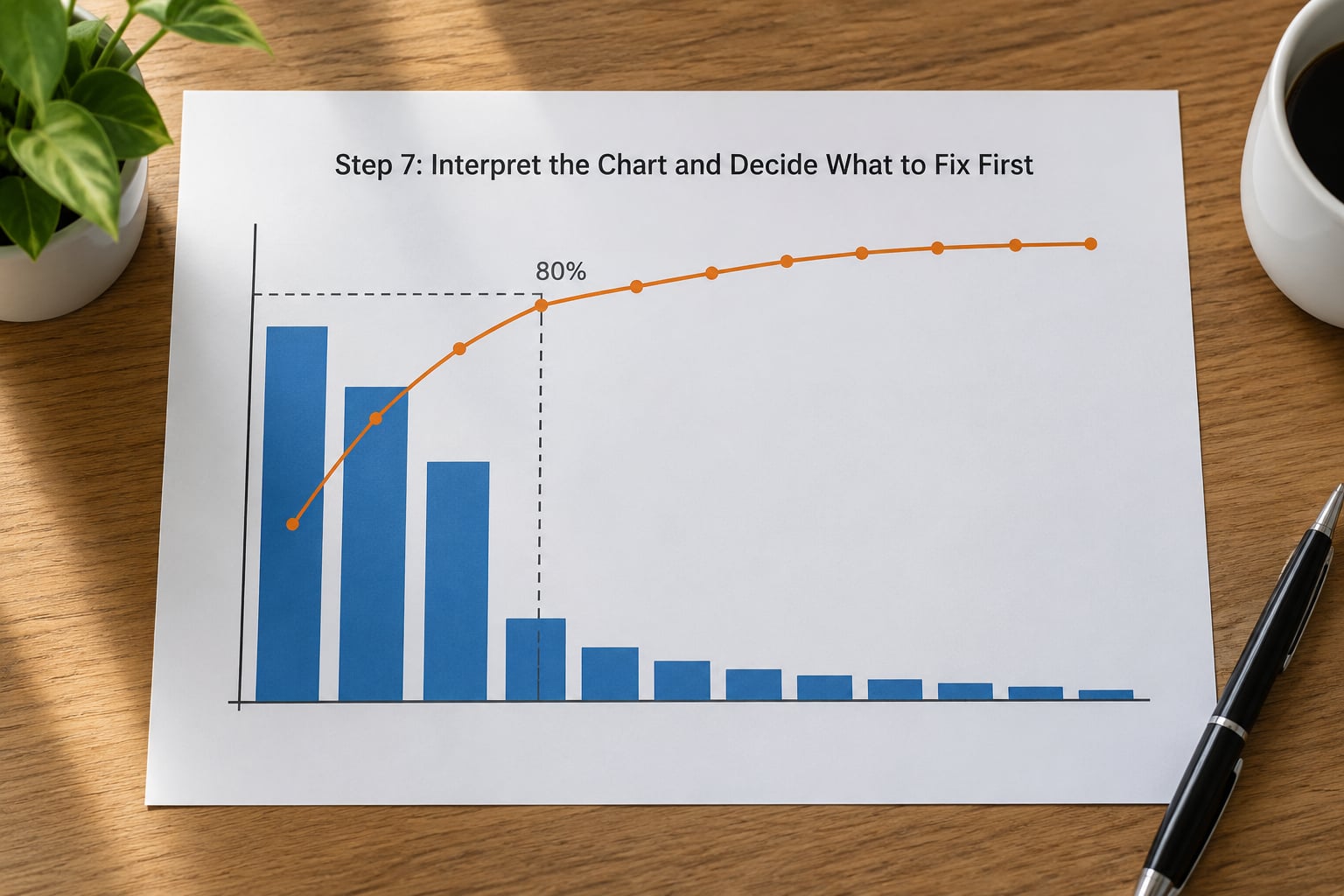
The 80% guideline says the causes to the left of the dashed line carry about four fifths of your defects, downtime or complaints, so that is where improvement effort goes first.
Read the shape of the curve, not just the 80% mark. A steep rise followed by a long flat tail is the classic pattern, and the categories in that flat tail are often not worth a project this quarter.
Treat 80% as a starting point rather than a law. When your data is close to evenly spread, the line climbs gently and there is no small set of causes to attack, which usually means the problem sits in the process rather than in a few part numbers.
Never drop a category because it falls past 80%. Safety items, regulatory defects and any failure with a customer or warranty consequence stay on the list no matter where the line crosses.
Once you have your ranking, move to the next tool. For molding defects specifically, this injection molding defects chart and fixes guide maps common defect names to their usual causes. If a category turns out to be moisture or drying related, how to read a psychrometric chart for dryers covers the process side.
Common Mistakes
- Bars left unsorted. A Pareto chart with ascending or alphabetical bars hides the very pattern you built it for. Sort before charting, and re-sort whenever the data updates.
- Mixed measurement units. Counts in some rows and cost in others make the cumulative line meaningless. Pick one unit per chart and state it in the title.
- Cumulative line flat along the bottom. The percentage series is still set to a column type, or the cell values are text rather than numbers. Change that series to Line and check that the cell format is General or Percent.
- Secondary axis maximum at 120%. Set Bounds Maximum to 1.0, or 100% if the axis is formatted as a percentage, so the line finishes at the top of the chart.
- An “Other” bucket that swallows real categories. If Other is the tallest bar, your categorization is failing. Split it before you draw the chart.
- Treating the 80% line as a rule. It is a prioritization guide. Safety, compliance and warranty items stay on your list regardless of where the line crosses.
- Unlabeled axes and no time window. A chart without units, a source and a date range cannot be checked by anyone reviewing it later.
Frequently Asked Questions
What does a correct Pareto chart look like?
Bars in descending order, tallest first, with the count or cost on the primary axis and a cumulative percentage line on a secondary axis running from 0% to 100%. The line starts at the origin and ends at exactly 100% on the last category. An 80% reference line is usually drawn, bars are close together rather than spread out, and the chart carries a title with the measure, unit and time period.
How do I calculate cumulative percentage in Excel?
Add a column next to your counts and enter =SUM($B$2:B2)/SUM($B$2:$B$8), then copy it down. The dollar signs lock the range of the grand total while the B2 reference expands as the formula moves down each row. Format the column as a percentage with one decimal place and the last row should read 100%.
Why is my Pareto chart not showing all my data?
Most often the categories are text or the cumulative column contains blanks, so Excel plots fewer points than you expect. Check that the last category has a value and that no row is left empty. Another cause is a hidden or filtered row: the built-in chart ignores hidden data unless you set it to plot hidden rows and cells in Select Data.
How do I count how many items make up 80% of the total?
With cumulative percentages in D2:D8, use =COUNTIF($D$2:$D$8,“0.8″)+1 to return the number of categories that reach the 80% mark. Wrap it in INDEX to pull the name of the last category in that set. This is the question that comes up most often on spreadsheet forums, and it saves scrolling back and forth through the chart.
Does the 80/20 rule always hold?
No. The 80/20 split describes many real datasets, not all of them. When the causes are close to evenly distributed, the cumulative line climbs gently with no sharp elbow and there is no small group worth isolating. Use the chart to rank categories by impact, then decide the cut point from cost, safety and effort rather than from the 80% line alone.
How do I add a Pareto chart to PowerPoint or Google Slides?
Copy the finished chart in Excel and paste it into the slide. Use Paste Special or Paste as Picture when you want a static image, and plain paste when you want a live chart that still updates from your data. In Google Slides, use Insert, Chart, then upload the chart file or paste from Sheets. Reformat the axes on the slide if the fonts look small.
Conclusion
Start with the data, not the chart. Write down the problem in one sentence, list every category with a single consistent measure, sort from largest to smallest, and add the two formula columns for percent of total and cumulative percentage.
Then build the combo chart, pull the secondary axis maximum back to 100%, and read off how many categories it takes to cross the 80% line. That number is your improvement target for the next review.