

An SPC chart is a time-ordered plot of one measured molding characteristic, usually part weight or a critical dimension, drawn against a center line and upper and lower control limits calculated from the process’s own short-term variation. The chart tells you whether the process is behaving the way it normally behaves, or whether something specific has changed. SPC charts for injection molding explained anywhere boil down to the same handful of ideas, and the rest of this guide is those ideas in the order you will need them.
Molding itself, in plain terms: pellets melt under a heated screw, get pushed into a steel cavity at speed, get packed while the part cools, and come out of the tool. Cycle after cycle, the machine is asked to repeat that sequence with almost identical results. SPC is simply the way of proving, cycle after cycle, that it did.
This guide walks through chart types, subgroup selection, the arithmetic behind control limits, the rules for reading a chart, and what to do the first time a point breaks a limit. It was last reviewed in 2026.
Table of Contents
- What SPC Charts Show in Injection Molding
- SPC Charts for Injection Molding: The Main Charts to Use
- How to Choose the Right Data and Measurement
- How to Read Control Limits and Center Lines
- How to Interpret Common SPC Chart Patterns
- SPC Charts for Different Injection Molding Defects
- How to Respond to an Out-of-Control Signal
- How to Use SPC Without Misusing the Charts
- A Practical Injection Molding SPC Routine
- Frequently Asked Questions
- What does an SPC chart tell you in injection molding?
- What are the 7 rules of control charts?
- How many parts should I go in each SPC subgroup?
- When should control limits be recalculated after a process change?
- What is the difference between Cpk and Ppk?
- Can I chart melt temperature and injection pressure instead of part dimensions?
- Start With the Process You Can Measure Consistently
What SPC Charts Show in Injection Molding
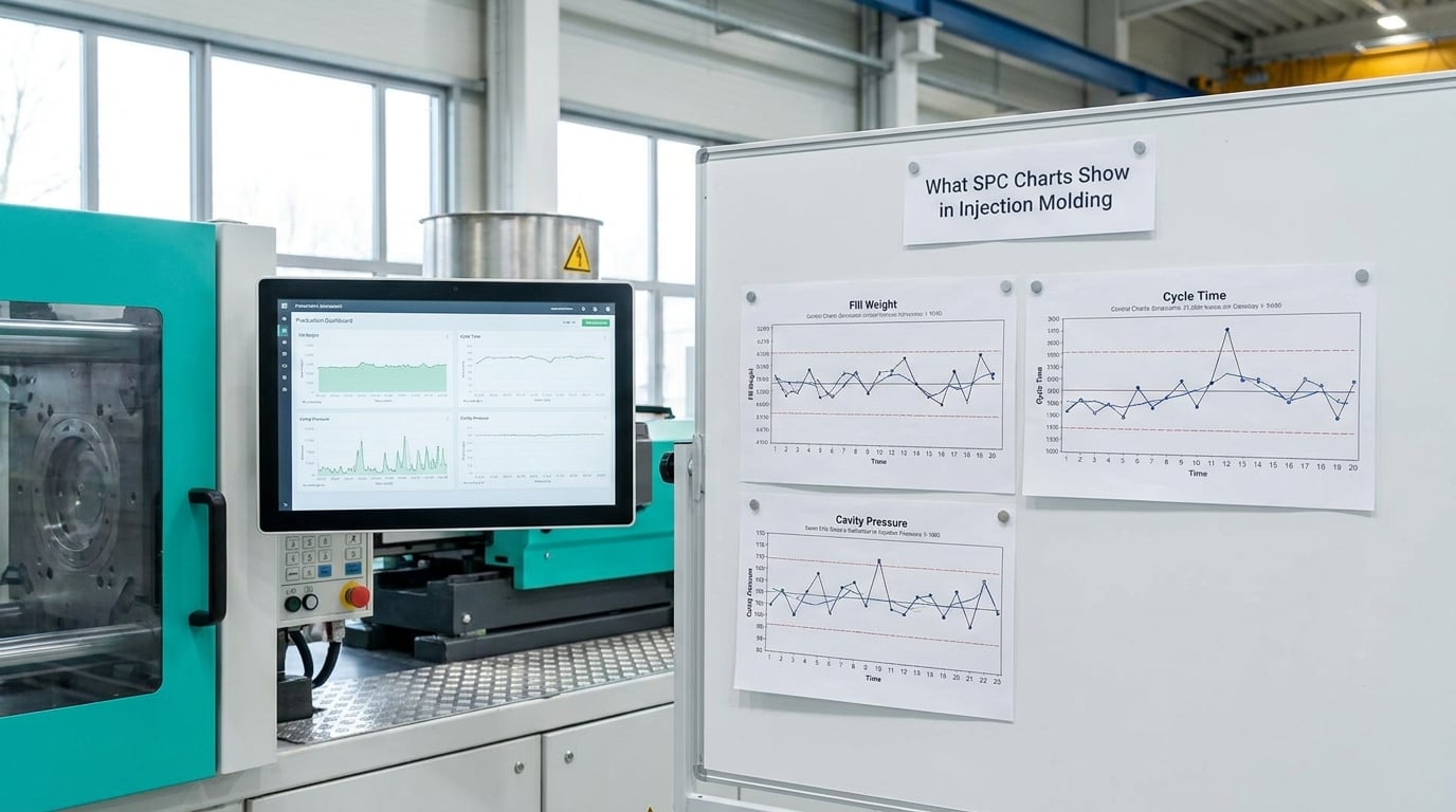
Statistical process control is a method for separating variation your process produces on its own from variation something external introduced. An SPC chart plots measured values in the order they were produced, so time is the horizontal axis and the process behavior is the story the line tells.
Common cause variation is the noise already built into the machine, the material, and the measurement: screw recovery that is not perfectly repeatable, resin lot differences, a thermocouple with normal drift. It shows up as random scatter around the center line and it is not a defect. Special cause variation is a real, traceable event: a heater band failing, a resin lot with different moisture, a cavity starting to flash, a new insert wearing in. Special cause shows up as a pattern the random scatter could not produce on its own.
The practical value is the distinction. A point outside the lower control limit on a part weight chart is a special cause, and it deserves an investigation. A point that is slightly low but comfortably inside the limits is just common cause, and the correct response to it is nothing at all.
The outputs most often charted in a molding cell are part weight on every shot, critical-to-quality dimensions checked on a cycle, melt temperature peak, injection and hold pressure, cavity pressure in a multi-cavity tool, cycle time, and the specific dimensions a customer calls significant on the drawing. Most shops that get value out of SPC chart three to five characteristics per part rather than everything, usually part weight plus one or two dimensions.
SPC Charts for Injection Molding: The Main Charts to Use
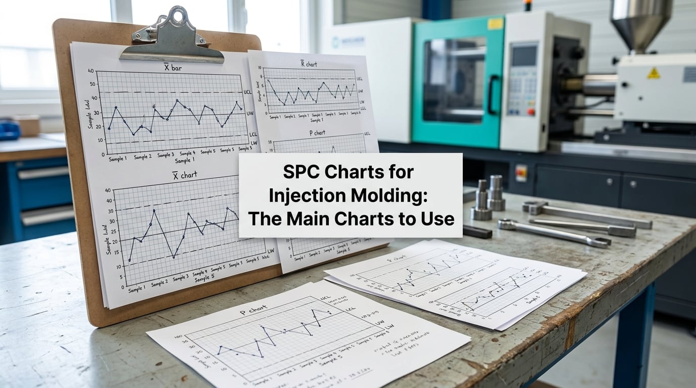
The right SPC chart depends on the shape of your data: are you measuring groups of parts, or one part at a time. For grouped measurement you use X-bar with a companion chart for spread. For single parts measured one at a time you use the individual and moving range chart, usually written I-MR. The attribute charts, C, U, p, and np, are for defect counts rather than measurements.
| Chart | Data type | Typical subgroup | What it detects | Molding use case |
|---|---|---|---|---|
| X-bar and R | Variable measurement | 2 to 5 consecutive shots | Shifts and trends in the process mean | Part weight sampled every few minutes; small subgroups, easy to compute by hand |
| X-bar and S | Variable measurement | 4 to 10 parts | Same, with a more stable spread estimate | Automated capture systems and larger samples where subgroups are machine-generated |
| I-MR | Single measurements | None, one part per point | Any change in individual values or in short-term spread | Every-shot machine parameters: melt temperature peak, peak pressure, cycle time |
| C chart | Count of defects | One part or one fixed sample | Change in the average number of defects per unit | Visual defect counts on a sampled tray, one defect counted once per part |
| U chart | Count of defects per unit | One part, possibly many defects | Average defects per part, including multiples | Short shots on a multi-cavity tool where one bad shot can show two or three defects |
| p and np charts | Proportion defective | Fixed sample size | Change in the fraction of parts failing | First pass yield on a fixed-size audit sample |
One detail in that table is worth pausing on. C and U look interchangeable and are not. C counts defective units, so a part with three defects counts as one. U counts defects, so that same part counts as three. If one cavity starts shorting while another is fine, you will see the failure sooner on a U chart than on a C chart.
Alongside the control charts themselves, SPC includes a small set of standard tools that practitioners use together. The classic seven are the histogram, the control chart, capability analysis, the Pareto chart, the cause-and-effect diagram, the flowchart, and the check sheet. On a molding floor the histogram shows the shape of a distribution in a single burst of data, the Pareto chart ranks defect causes by frequency, the fishbone diagram sorts a suspected cause into material, tool, machine, method, people, or measurement, and the check sheet is where an operator records observations on the floor. The control chart is the only one of the seven that tells you whether the process changed over time.
How to Choose the Right Data and Measurement
Subgrouping is the decision that most affects whether your chart is useful, and it is the one most often made carelessly. A subgroup should be a set of parts produced as close together in time as possible, so that the variation inside the subgroup is common cause and the variation between subgroups is where a real change will show up.
Grouping by machine, by cavity, by material lot, by operator, or by time interval each answers a different question. A subgroup of four consecutive shots from one machine answers: is this machine still behaving? A subgroup made of one shot from each of four cavities answers: is the tool still balanced? A subgroup drawn from a single resin lot answers: did something change with this lot? If you mix machines and cavities together in one series, an imbalance and a material problem show up as the same thing, and you will investigate the wrong one.
Common subgroup sizes in molding are three to five consecutive shots, often combined with a pressure or temperature reading from the same cycle so the two charts are aligned in time. For per-cavity work on a multi-cavity tool, chart each cavity as its own series with its own limits, or chart the difference between cavities against the mean. Cavity imbalance then appears as a stable step pattern that repeats every cycle, while a process shift appears as a level change in every cavity at the same time. Those two signatures look similar on a single combined chart and completely different when the cavities are separated.
Sample frequency depends on how fast the process can drift. Part weight is commonly checked every few minutes on a running production part, with more frequent checks during start-up. You need at least 20 to 25 subgroups before a first set of limits means anything, which is why a capable baseline run, not a hopeful guess, has to come before the limits are calculated.
Before you trust a single number, check the measurement system. A Gage R&R study on the gauge or CMM you use tells you how much of the variation you are seeing is the measurement itself, and most shops aim for ten percent or less on critical characteristics, with tighter expectations in medical work. Seaskymedical, a contract manufacturer that publishes its own requirements, states the same ten percent threshold and requires measurement system analysis to be complete before any capability study is run. If the gauge contributes more variation than the process, you are charting the gauge.
On older machines with no automated capture, the honest approach is a batch sheet: operators weigh a part at fixed intervals, write the value down, and the entries get transcribed into a chart once a shift. Transcription errors are real, so build in a double-check on a sample of entries rather than assuming perfection.
How to Read Control Limits and Center Lines
Four lines matter on a molding chart, and confusing any of them leads to bad decisions. The center line is the average of the process. The control limits sit three estimated standard deviations above and below it, and they describe what the process is capable of doing on its own, not what the customer asked for.
| Line or limit | What it represents | Where it comes from | What it tells you |
|---|---|---|---|
| Center line (X-double-bar) | Average of the plotted statistic | Mean of the baseline subgroup averages | Where the process currently sits relative to the tolerance |
| Upper control limit (UCL) | Natural process limit, upper | Center line plus A2 times R-bar | Normal variation is very unlikely to exceed this |
| Lower control limit (LCL) | Natural process limit, lower | Center line minus A2 times R-bar | Normal variation is very unlikely to fall below this |
| Specification limits (USL, LSL) | Customer or drawing requirement | The print, or the customer drawing | Whether the part passes or fails acceptance |
Here is a worked example using part weight, because seeing the arithmetic once makes the rest of this easier. Five subgroups of four consecutive shots, all values in grams:
| Subgroup | Weights | Subgroup average (X-bar) | Range (R) |
|---|---|---|---|
| 1 | 24.98, 25.01, 25.00, 24.99 | 24.995 | 0.03 |
| 2 | 25.02, 25.00, 25.01, 25.00 | 25.008 | 0.02 |
| 3 | 24.99, 25.01, 25.02, 25.00 | 25.005 | 0.03 |
| 4 | 25.00, 25.01, 24.99, 25.02 | 25.005 | 0.03 |
| 5 | 24.97, 25.00, 25.01, 24.98 | 24.990 | 0.04 |
The grand average is 25.0005 grams and the average range, R-bar, is 0.03 grams. For a subgroup size of four, the A2 constant is 0.577, so the control limits on the X-bar chart are 25.0005 plus and minus 0.577 times 0.03, which is 0.0173 grams. That gives an UCL of 25.018 and an LCL of 24.983. On the companion R chart, D4 of 2.115 gives an upper limit of 0.063 grams and a lower limit of zero, since a range can never be negative.
The same data gives a standard deviation estimate. Dividing R-bar by the d2 constant of 2.059 for subgroups of four gives roughly 0.0146 grams, and 0.0146 times three is what the control limits are built on. If the drawing calls for 24.95 to 25.05 grams, the capability indices follow. Cp, which only asks how wide the tolerance is compared to the spread, is 0.10 divided by six sigma, which works out to 1.14. Cpk also asks where the mean sits, and at 25.0005 grams the process is nearly centered, so Cpk comes out at 1.13.
Now imagine the same process drifts so the mean sits at 25.02 grams. Cp is unchanged at 1.14, because the spread did not change. Cpk drops to 0.77, because the process mean is running into the upper specification limit. That gap is the whole argument for using Cpk: a process can have beautiful spread and still make parts that fail the print.
| Index | What it measures | Data it assumes | When a customer asks for it |
|---|---|---|---|
| Cp | Tolerance width against spread | Process mean is exactly centered | Rarely on its own; useful as a spread ceiling |
| Cpk | Tolerance width against spread, with the mean in the equation | Short-term, within-subgroup sigma, from a stable period | Launch capability studies, PPAP submissions, quote requirements |
| Ppk | Same as Cpk but using overall long-term sigma | All the data you collected, including any out-of-control periods | Process monitoring after launch, when real-world drift is included |
Common capability targets are 1.33 for general characteristics and 1.67 for critical or safety-related ones, which is the threshold Seaskymedical applies to medical components. A customer may set their own number, and a print tolerance of plus or minus 0.01 mm on a dimension that the process simply cannot hold will never yield a 1.67 no matter what the chart says.
How to Interpret Common SPC Chart Patterns
Points beyond the limits only catch a fraction of real problems. Most special causes show up as patterns first, which is why experienced operators read a chart by eye rather than waiting for an alarm. The seven rules below are the standard test set, and each one has a molding meaning.
- One point beyond a control limit. The most obvious signal. On part weight, look at resin lot, dryer conditions, and a mold temperature that has moved.
- Two of three consecutive points beyond two sigma on the same side. A gentle move that has not crossed the line yet. Often the first visible sign of heater degradation.
- Four of five consecutive points beyond one sigma on the same side. The process is walking. Check screw recovery time and hold pressure consistency.
- Eight consecutive points on one side of the center line. A sustained shift, and one of the most useful rules on a molding chart because a resin lot change shows up here for hours before it reaches a limit.
- Six consecutive points steadily rising or falling. Tool wear is the classic cause. On a short-shot-prone part, a rising part weight trend often means the gate is eroding.
- Fifteen consecutive points within one sigma of the center line. Not a good thing. It suggests the subgrouping is wrong, or someone has tightened the limits, or the chart is recording a setpoint instead of a real measurement.
- Alternating points above and below the center line. Often a check that alternates on every other shot, or a thermocouple cycling. A very regular oscillation is a machine or fixture signature rather than random noise.
Two more patterns are worth naming. Points that hug one control limit without crossing it, called hugging, usually mean the process is running near the edge of its own natural variation and has no room left for the next disturbance. And a sudden spike far outside everything else, with the rest of the chart steady, is a single event: a dropped part, a bad closure, a gauge knocked out of calibration.
SPC Charts for Different Injection Molding Defects
The characteristic you chart determines which defect you see first. Weight and pressure catch fill problems, dimensions catch shrink and warpage problems, and a defect like flash shows up on none of them until the flash itself is counted.
| Characteristic charted | Drift signature | Likely root cause to check first | Defect that shows up |
|---|---|---|---|
| Part weight, all cavities | Step down or up, sustained | Hold pressure or hold time change, resin lot viscosity, dryer time | Short shots, sink marks, weight out of tolerance |
| Part weight, one cavity | Stable step that repeats every cycle | Cavity imbalance, blocked nozzle or cold slug well in that cavity | Cavity-to-cavity variation, one cavity short |
| Melt temperature peak | Slow fall over hours | Heater band degradation, thermocouple drift, screw barrel wear | Flow lines, weld lines, dimensional variation, flash |
| Peak injection pressure | Rising with a constant fill time | Gate wear, cold slug, mold fouling, resin viscosity change | Short shots at the end of flow, flash if pressure climbs further |
| Cycle time | Gradual increase | Cooling time setpoint drift, mold fouling, robot interference | Dimension variation as parts are pulled too warm |
| Critical dimension on the print | Trend toward a specification limit | Pack profile change, uneven cooling, insert wear | Dimensional nonconformance, warpage |
| Defect count on a U chart | Rate climbing on one cavity | Hot runner blockage, gas entrapment, venting | Short shots, flash, burns |
The order of investigation matters. A pressure sensor on a hot runner is a faster and more sensitive indicator than a part weight taken once every five minutes, which is why per-cavity pressure and temperature sensing is the standard answer for a multi-cavity tool. Ray Dorow, a quality manager interviewed by Kaysun, describes a shop where CMM and vision data upload automatically to the quality system and produce live Cpk charts, alerting the team the moment something goes out of specification. That level of automation is not universal, but the principle holds: chart the earliest available signal, not the finished dimension.
How to Respond to an Out-of-Control Signal
The reaction plan matters more than the chart. A chart that produces a signal nobody acts on is decoration, and a chart that triggers a panic adjustment every hour is worse than no chart at all. Six steps, in order.
- Confirm the measurement. Reweigh the part, check gauge calibration, confirm the chart is recording actual values and not a setpoint. A miscalibrated scale produces a beautiful, perfectly explainable chart of nothing.
- Contain the affected product. Segregate everything produced since the last good check, not since the signal. Hold the parts already shipped only if the signal reaches back to a defined point.
- Pull up the timeline. Note the time of the signal and pull material lot, dryer cycle, shift, tool change, and maintenance records for that window. In a molding cell, the log is usually right there on the machine.
- Investigate in a fixed order. Material, then tooling, then process settings, then the machine. Starting with the parameter you can change fastest produces changes that hide evidence.
- Adjust once, in a controlled way. Change one setting, by a deliberate amount, and record it. Multiple simultaneous changes make the next chart unreadable.
- Confirm stability before re-baselining. Let the process run and prove it is stable, then recalculate the limits. Raising limits after a fix without a capable run, as one practitioner put it, produces limits that come from hope rather than data.
One practical piece of advice from a mold designer writing on Kenvox: when a rule breaks, hold and investigate rather than adjusting. The same writer describes establishing a capable baseline by weighing parts at two, four, six, and eight seconds of hold until the weight flattens, then adding a safety margin. That is what a real baseline run looks like on a molding floor, and it is the only honest source of first control limits.
How to Use SPC Without Misusing the Charts
The most common failure on a molding floor is not charting badly. It is over-correcting a process that was already stable, which practitioners call tampering. Each small adjustment resets the pattern, the next few points look like a shift, and the operator adjusts again. Total variation goes up, capability numbers fall, and nothing is actually wrong with the machine.
Tightening control limits is the other big one. Limits narrower than the process’s natural variation guarantee a stream of false alarms, and a team that cries wolf stops reacting to real signals. Set them from a capable run, then leave them alone.
Mixing data streams causes the rest. Putting two machines, two molds, or two resin lots into one series produces a chart that looks unstable for structural reasons and can never stabilize. If you have genuinely different conditions, you have genuinely different charts, each with its own limits.
Treating specification limits as control limits is the misunderstanding that survives longest, and the table earlier is the fix. A part can be in specification and out of control, and it can be inside control limits and out of specification. Those are two different failures with two different responses, and only one of them belongs to the machine.
Finally, reacting to a single isolated point. One excursion in fifty subgroups is normal common cause behavior. The rules exist precisely so you do not chase it. React to patterns, react to sustained shifts, and let single points pass unless they fall outside the limits.
A Practical Injection Molding SPC Routine
A routine is what separates SPC from a chart that gets built once for an audit. The cadence below is a starting point, not a rule.
Every shift. The operator weighs one part at a fixed interval, records the value, and checks the chart for signals. A signal goes to the process engineer before the end of the shift, not at the end of the week. The operator’s job is to flag, not to fix.
Weekly. The process or quality engineer reviews every open chart, lists which signals are still unexplained, and checks whether any corrective action actually held. A short written record of each signal, the investigation, and the outcome is what turns a chart into evidence. Where customers require it, this record feeds the control plan and PPAP package.
At every process change. A new resin lot, a new mold, a significant parameter change, or maintenance that touches the screw or hot runner. Collect a fresh baseline, verify stability, and re-baseline the limits. Until that is done, treat the chart as a baseline study rather than a control chart.
Records worth keeping are short and boring: the chart itself, the subgroup data behind it, the measurement system analysis, the reaction plan written down before it is needed, and a log of adjustments with times. Quality America uses injection molding as its worked example for SPC in training material, and the same habit shows up in the audits: the documentation is what proves the process was controlled, not the fact that it was.
Frequently Asked Questions
What does an SPC chart tell you in injection molding?
An SPC chart tells you whether the molding process is still behaving the way it behaved during a known-good baseline run. It plots part weight, dimensions, or machine parameters in production order against a center line and control limits calculated from the process’s own short-term variation. A pattern outside those limits means a specific, traceable event changed something, and the chart gives you the time to find it before defective parts pile up.
What are the 7 rules of control charts?
The seven standard rules are: one point beyond a control limit; two of three consecutive points beyond two sigma on the same side; four of five beyond one sigma on the same side; eight consecutive points on one side of the center line; six points trending steadily up or down; fifteen points within one sigma of the center line; and fourteen alternating points above and below. The rules catch patterns that a single limit test misses.
How many parts should I go in each SPC subgroup?
Two to five consecutive shots is the usual range for injection molding, with four a common default because the calculation constants are well tabulated for it. The subgroup should be parts produced as close together in time as possible so that within-subgroup variation is normal noise and changes show up between subgroups. If you are charting per cavity, make each subgroup one shot from each cavity instead of four consecutive shots from the same one.
When should control limits be recalculated after a process change?
Recalculate them once the process has proven stable under the new conditions, not immediately after the change. Change a resin lot, mold, or significant setting, collect roughly twenty-five subgroups, and treat that period as a baseline study with limits still under evaluation. Once the new run is stable and capable, freeze new limits and start a fresh chart. Re-baselining before stability just hides the drift you were looking for.
What is the difference between Cpk and Ppk?
Cpk uses the short-term standard deviation estimated from within-subgroup data, which assumes the process was stable during the period studied. Ppk uses the overall long-term standard deviation across everything you collected, including any drift. Because real molding processes drift, Ppk is usually lower than Cpk, and a large gap between them is itself a signal that the process is not in control. Customers often ask for Cpk at launch and Ppk during production.
Can I chart melt temperature and injection pressure instead of part dimensions?
You can, and on many machines you should, because machine parameters are captured on every shot while dimensions are sampled. The caution is direction of inference: a stable pressure chart does not prove the part is in specification. Seaskymedical’s practice is to calculate Cpk on critical product attributes and use machine parameters as an input stability check. Chart both, but let the parts decide whether the process is capable.
Start With the Process You Can Measure Consistently
Pick one characteristic you can measure the same way every time, usually part weight, and plot it on the simplest chart that fits your data. Collect a capable baseline of at least twenty-five subgroups, calculate the limits from that run, and start reading the chart for patterns rather than for points.
Everything else, the cavity pressure sensing, the automated Cpk reporting, the capability study, comes after that first honest chart exists and someone is acting on its signals. The chart is the conversation, not the software.